I participated in RGD's 2021 Designathon! For this two-day event, a number of emerging and student designers get put into groups to tackle a brief from a local nonprofit. We're also paired with an mentor from RGD. I was assigned to Arts Etobicoke, along with two others. Arts Etobicoke is a community arts organization that offers events, programming, classes, and workshops. Their goal is to bring the community together, as Etobicoke is one of the most culturally and economically diverse communities in Toronto.
Through the written brief and a meeting with the client, we learned the task at hand. Arts Etobicoke was coming up on their 50th anniversary. They were looking for a logo and identity to be repurposed through the year, to be used on the website, in fundraising, on the newsletter, in advertising, and on event material. They wanted this identity to mark a celebration of their accomplishments. They emphasized awareness of their history and their place in the community.
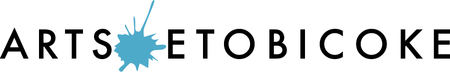
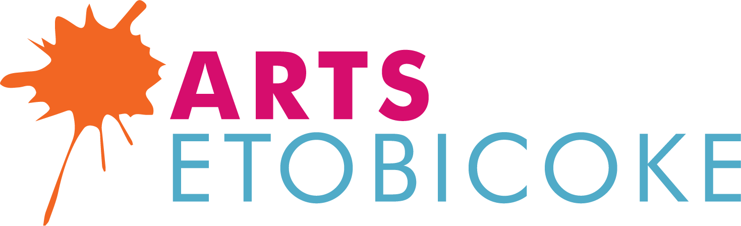
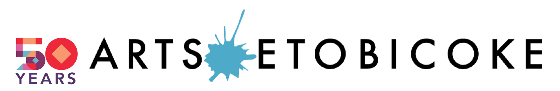
Arts Etobicoke's existing wordmark and stacked logo.
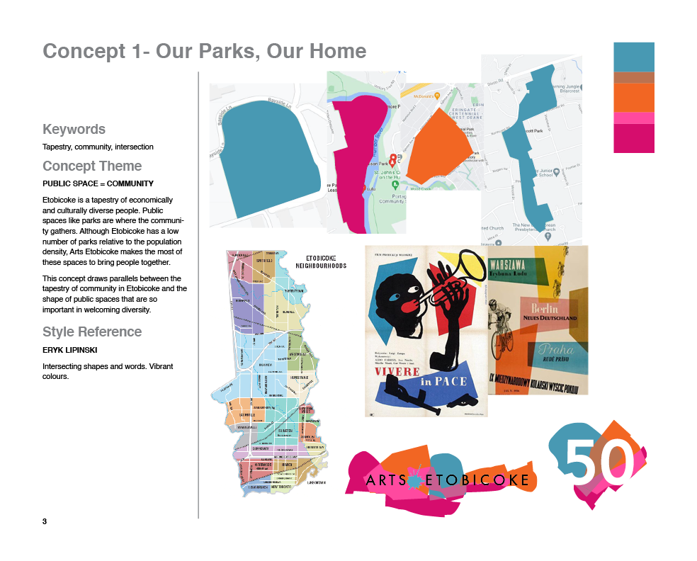
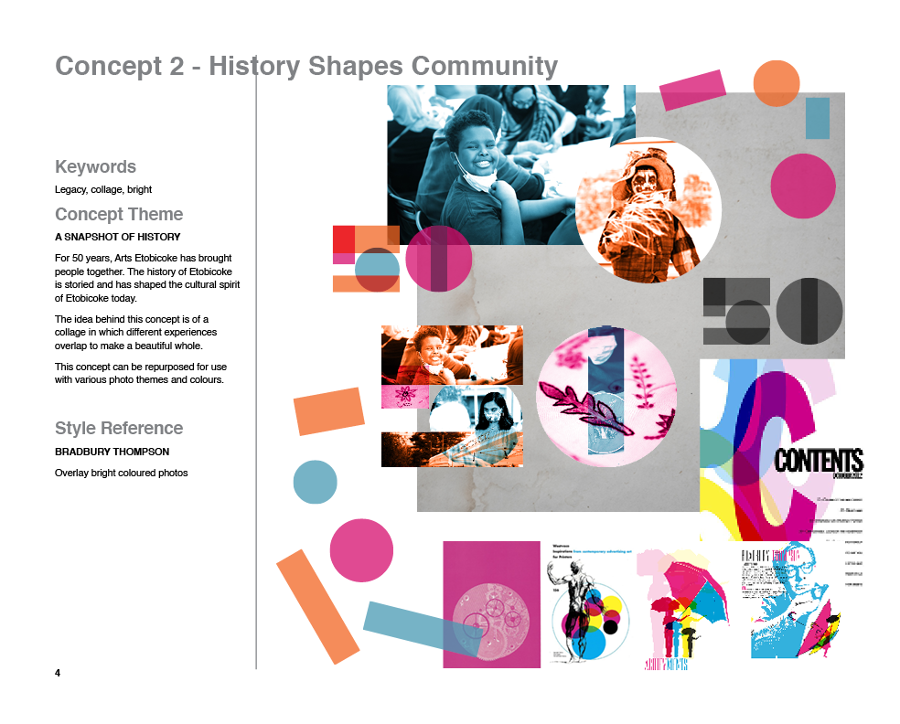
After the initial meeting, the members of our team split off to ideate. I came up with two possible concepts and created a concept board for each. I used the existing colour palette of the brand.
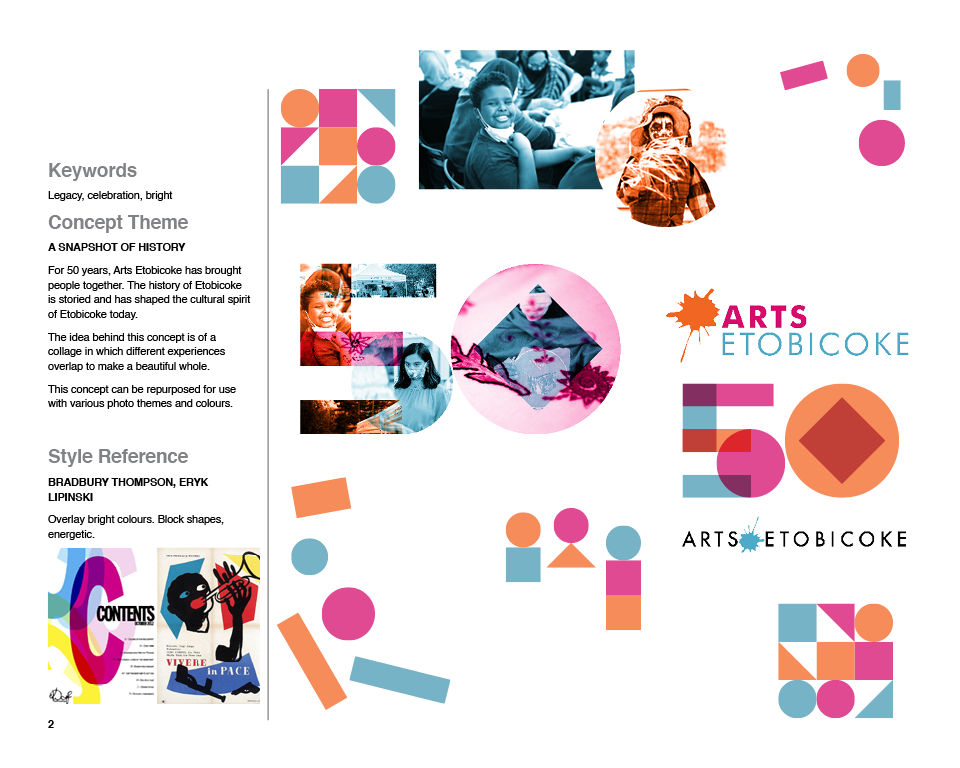
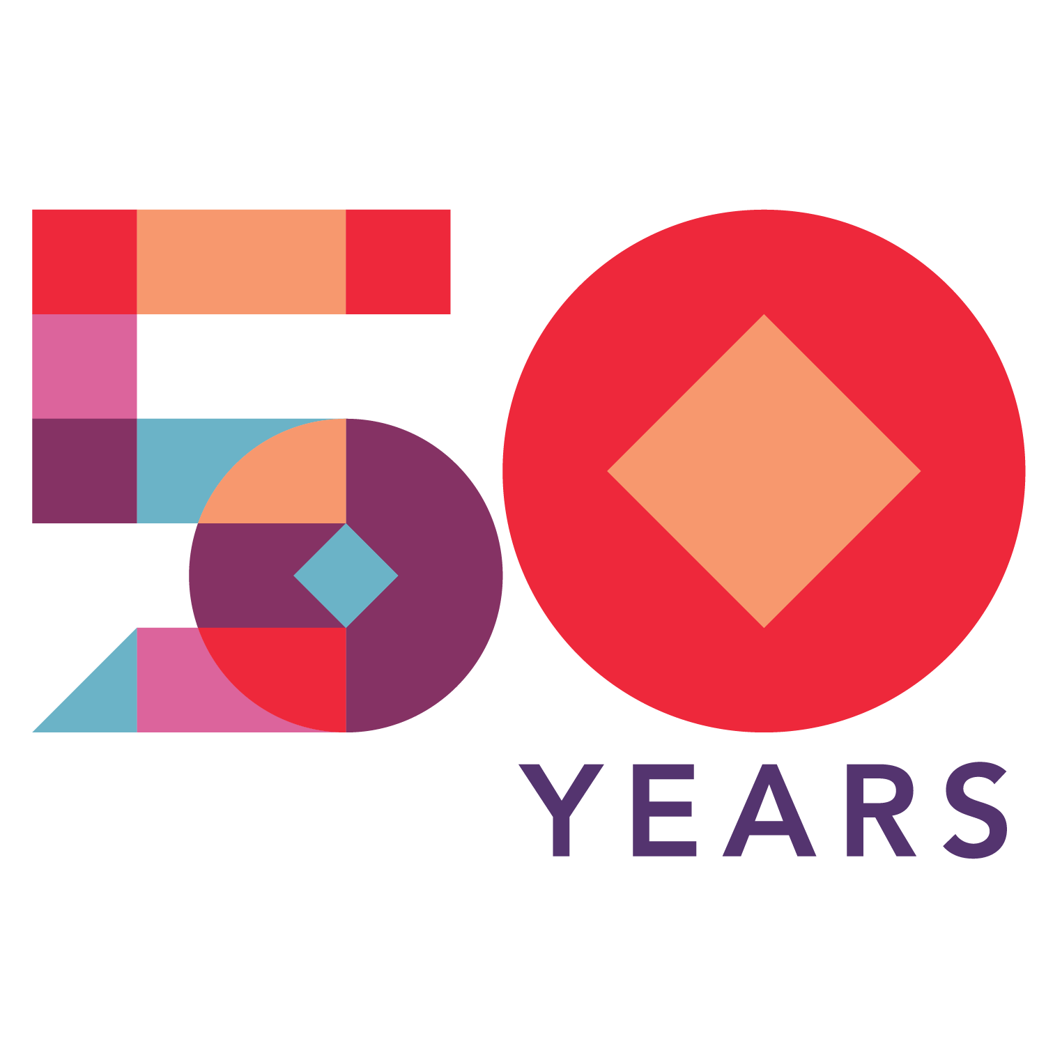
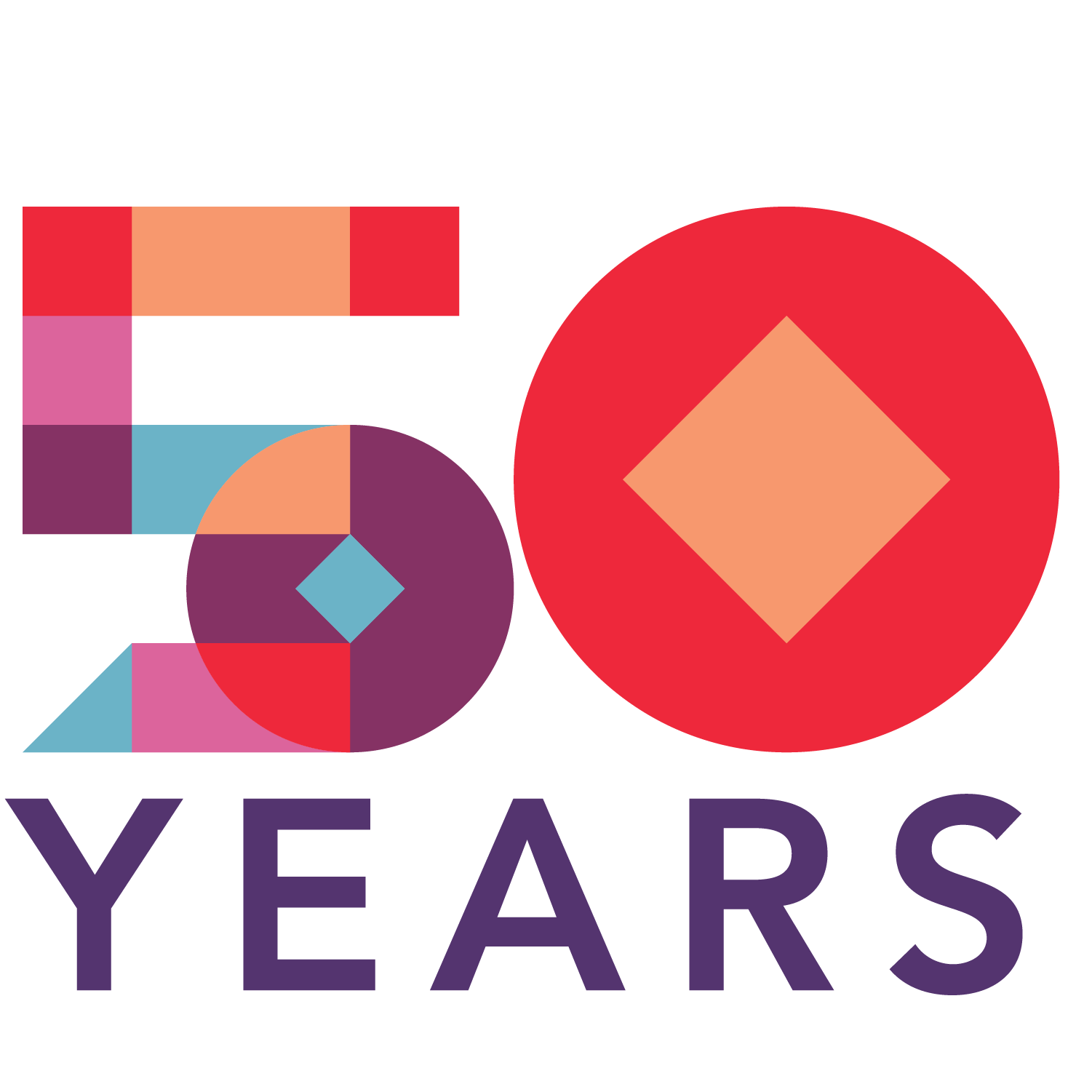
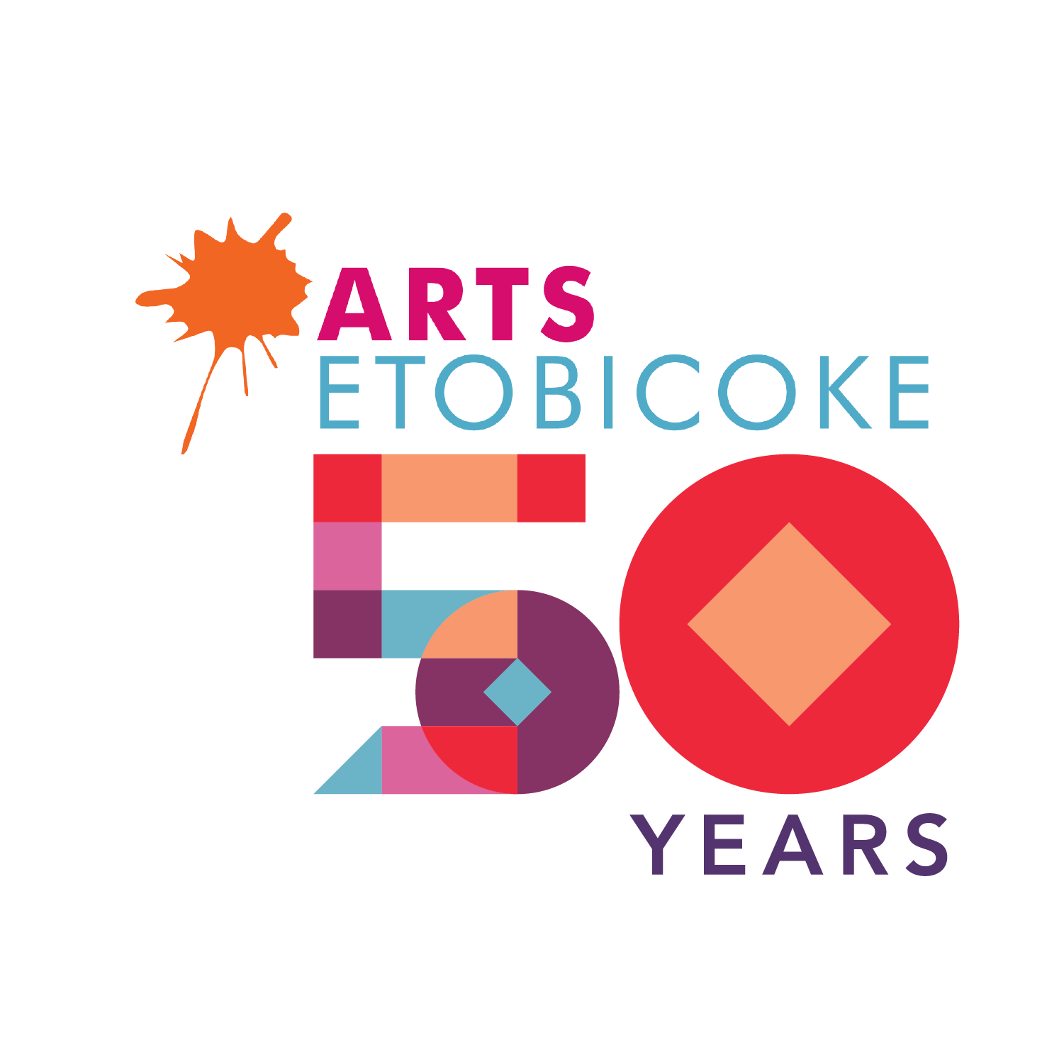
Our group narrowed down our 3 strongest ideas, and presented them to the client. I proudly presented the concept "Shaped by History". The driving idea behind this concept is that the history and people of Etobicoke are the building blocks
Our client took our ideas home and deliberated with their team. That night, we found out they wanted to continue with the concept I presented: "Shaped by History"!
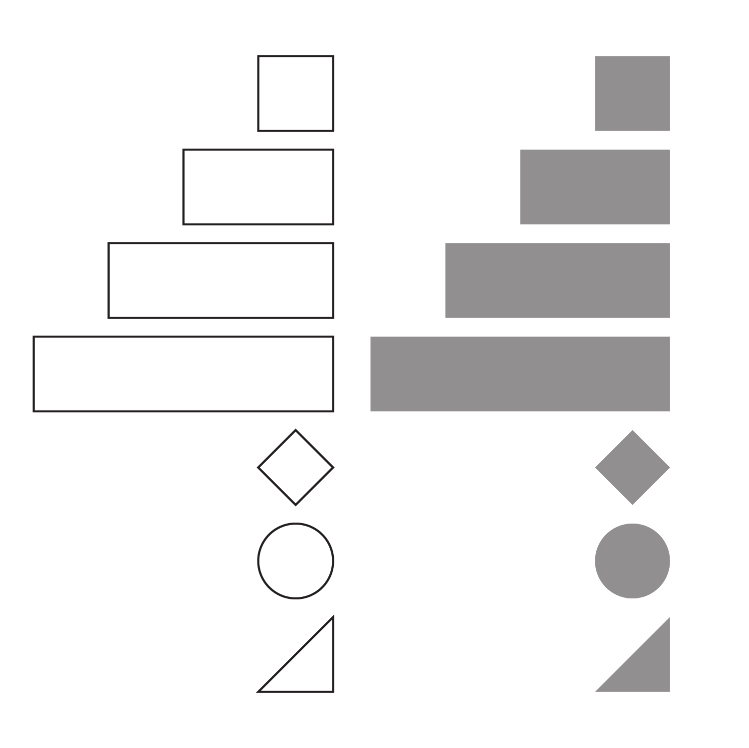
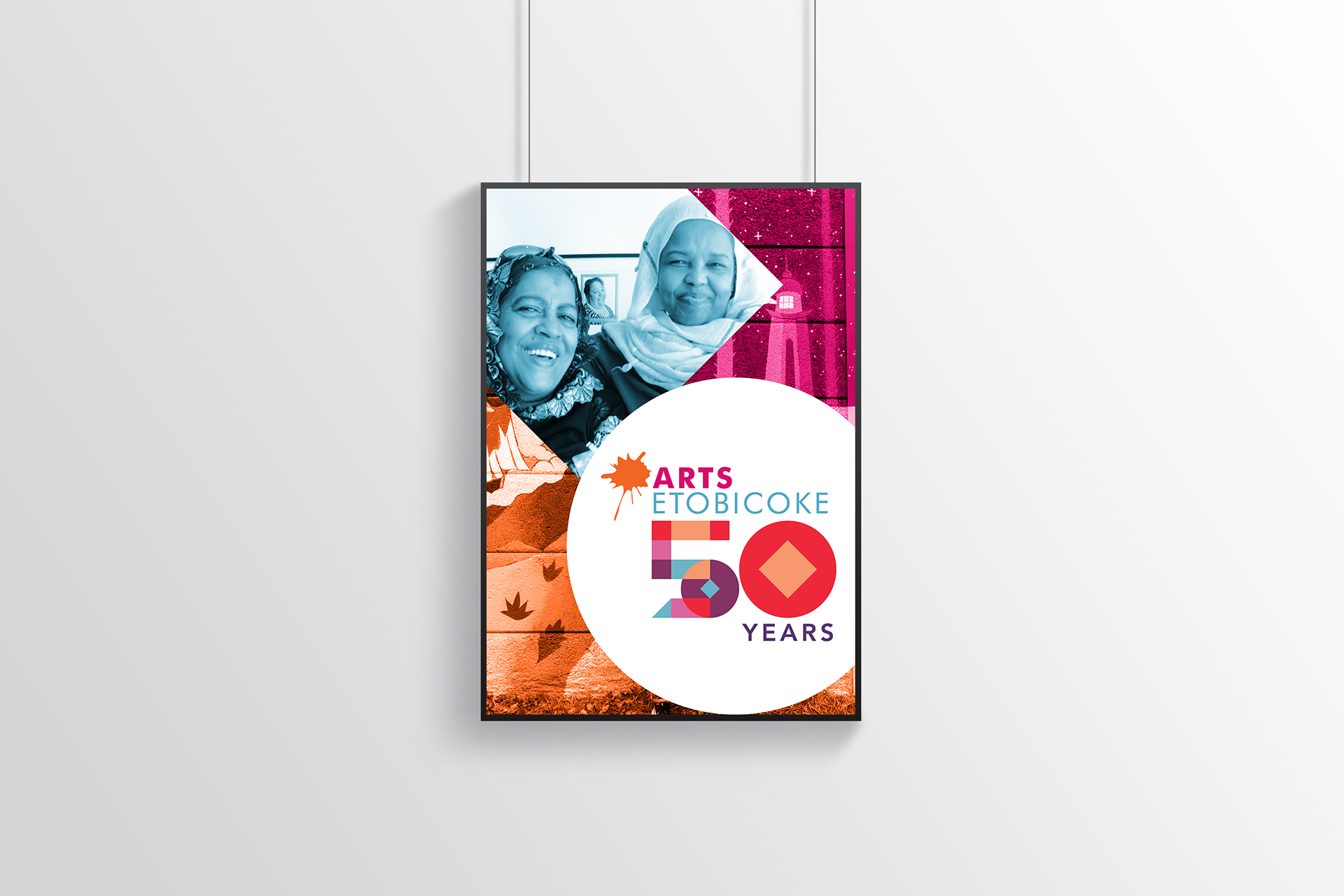
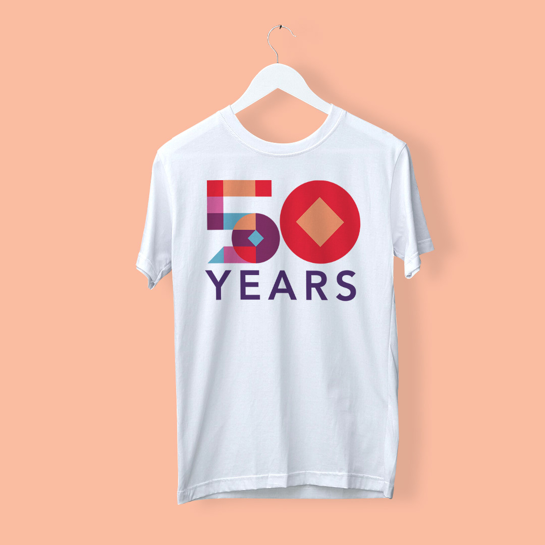
The next day, we started fleshing out the idea. I was tasked with refining the logo, to finalize the shapes and colours so my group members could start working on expanding the application of the identity. By overlaying the current brand colours with a colour burn blending mode, we were able to create a unique 50th anniversary colour palette.
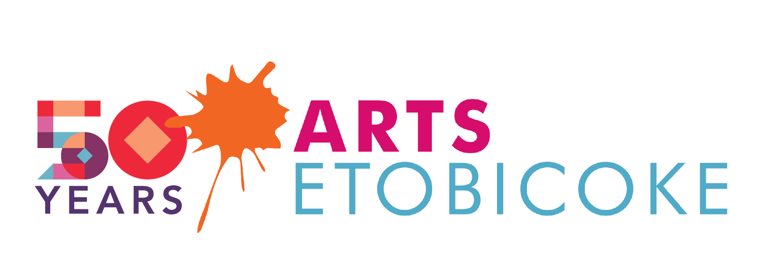
And here are the final logo and lockups!
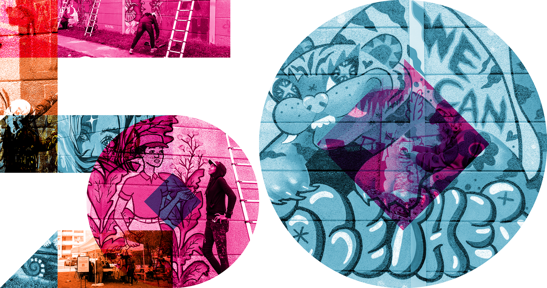
But that's not all! I also expanded on the image treatment I presented in my original concept board. Applying gradient maps, I built the logo out of archival images to show the possibilities of this 50 year identity.
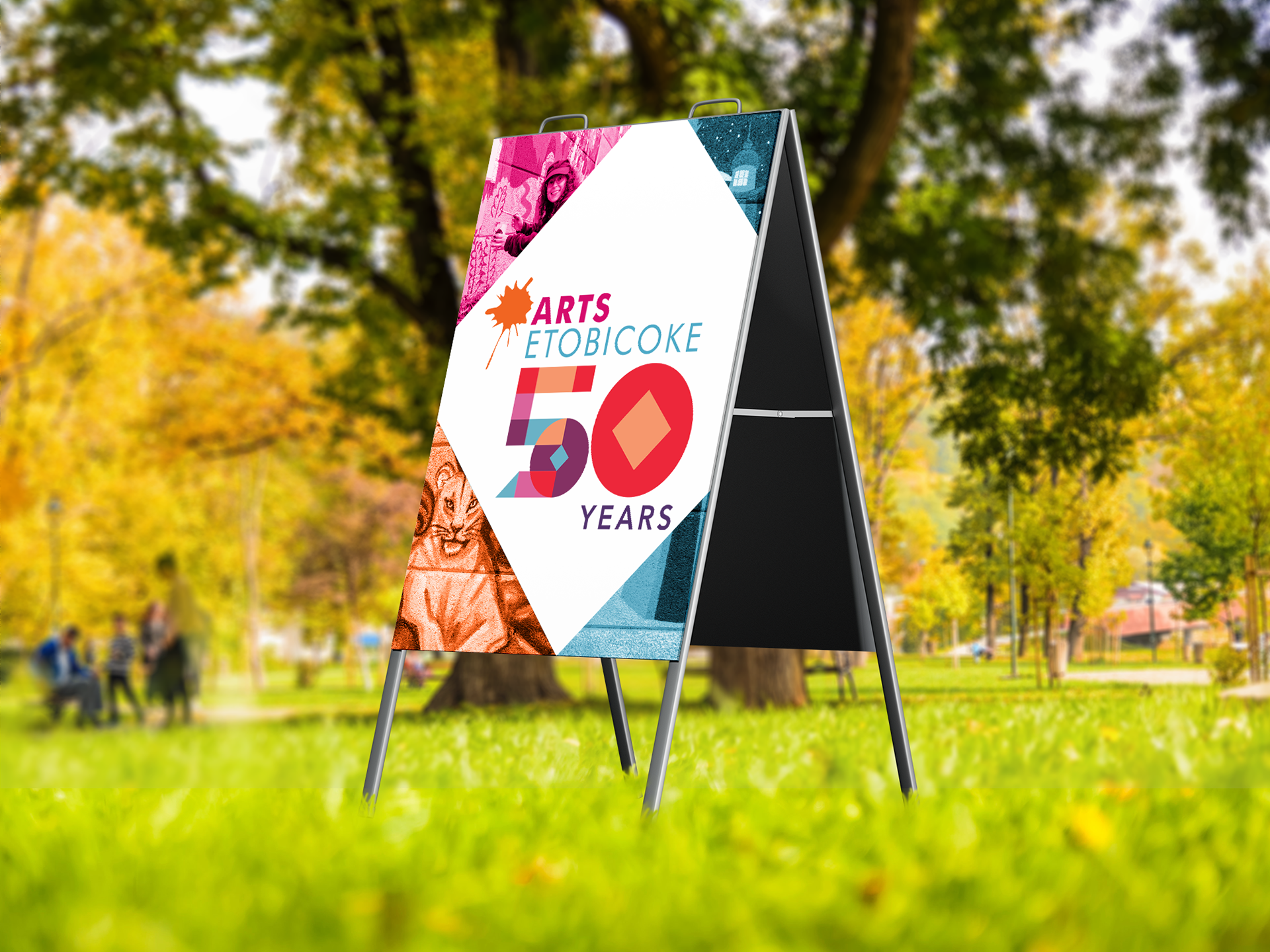
I made this into a photoshop template, too! Using shapes and smart objects makes it easy for the client to swap out the photos at will. Lastly, I created some mockups to show possible applications of the identity and give layout examples.
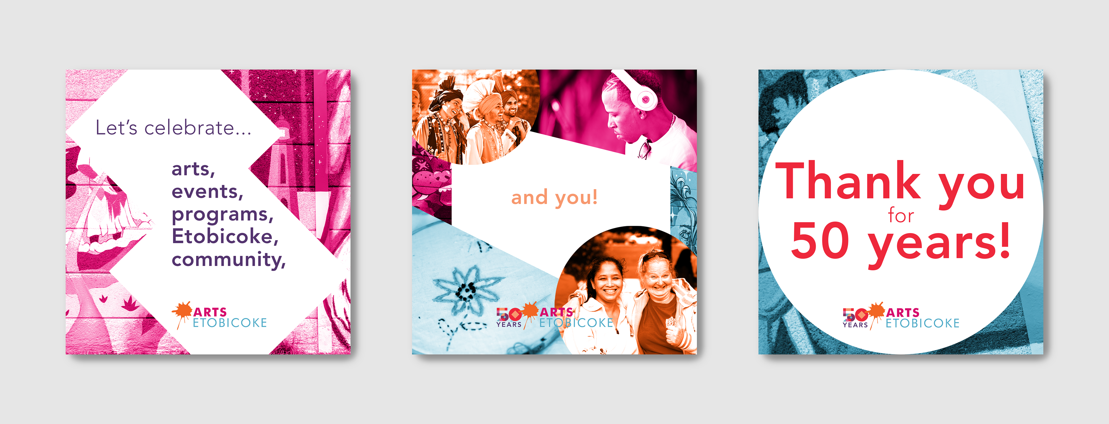
Instagram carousel example
We finally presented the identity to the client, and they loved it!
This was such a fun project. The deadline was tight, and this is the first time any of us had done something like this. I'm so proud of the work our team did. If you're an emerging designer, definitely check out RGD's Designathon. Maybe we'll see each other at the next one!